

Blue Shamrock is a welcoming gathering place in the heart of St. Louis, Michigan. Rooted in Irish tradition and Michigan pride, we bring people together over good food, great drinks, and genuine hospitality. Our name blends the luck of the shamrock with the spirit of community, creating a space where everyone feels at home. Whether you’re a local regular or just passing through, The Blue Shamrock is where memories are made and stories are shared.
Project Pitch:
This project is aimed at developing understanding of branding and brand evolution. For this project, students will redesign an existing local brand, expanding its reach with a dynamic visual system. Students will transform a static brand into a dynamic system
Authentic | Heritage | Quality | Loyalty | Family | Authentic | Heritage | Quality | Loyalty | Family |
Authentic | Heritage | Quality | Loyalty | Family | Authentic | Heritage | Quality | Loyalty | Family |
Mission
Blue Shamrock exists to bring people together over good food, great drinks, and genuine hospitality. More than just a pub, Blue Shamrock is a gathering place where friendships grow, stories are shared, and every guest feels like part of the family. Rooted in Irish tradition and Michigan pride, we hope to create a welcoming space that combines quality, loyalty, family, heritage and authenticity where both locals and travelers alike can gather, connect, and feel at home.
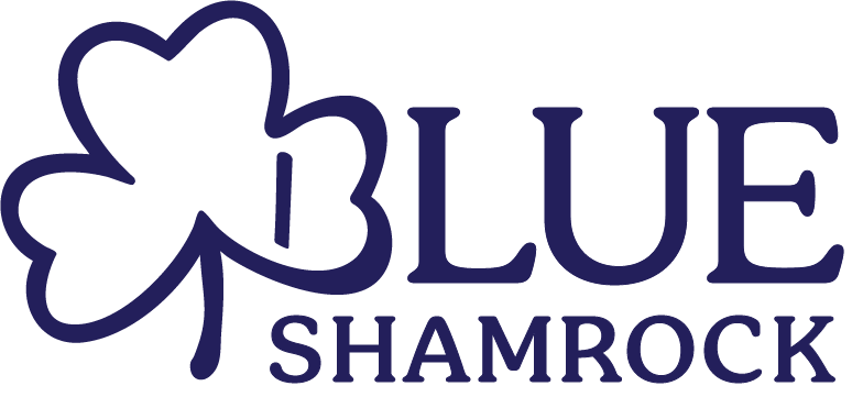
Primary Logo

Secondary Logo

Submark

Typography


Primary Colors
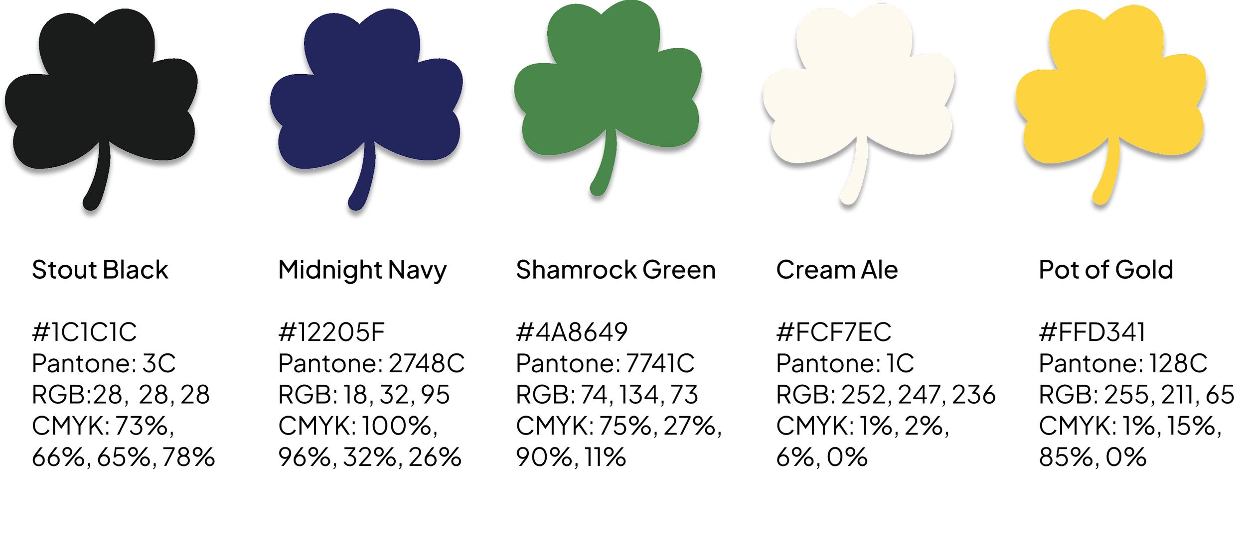
Secondary Colors

Color Accessibility
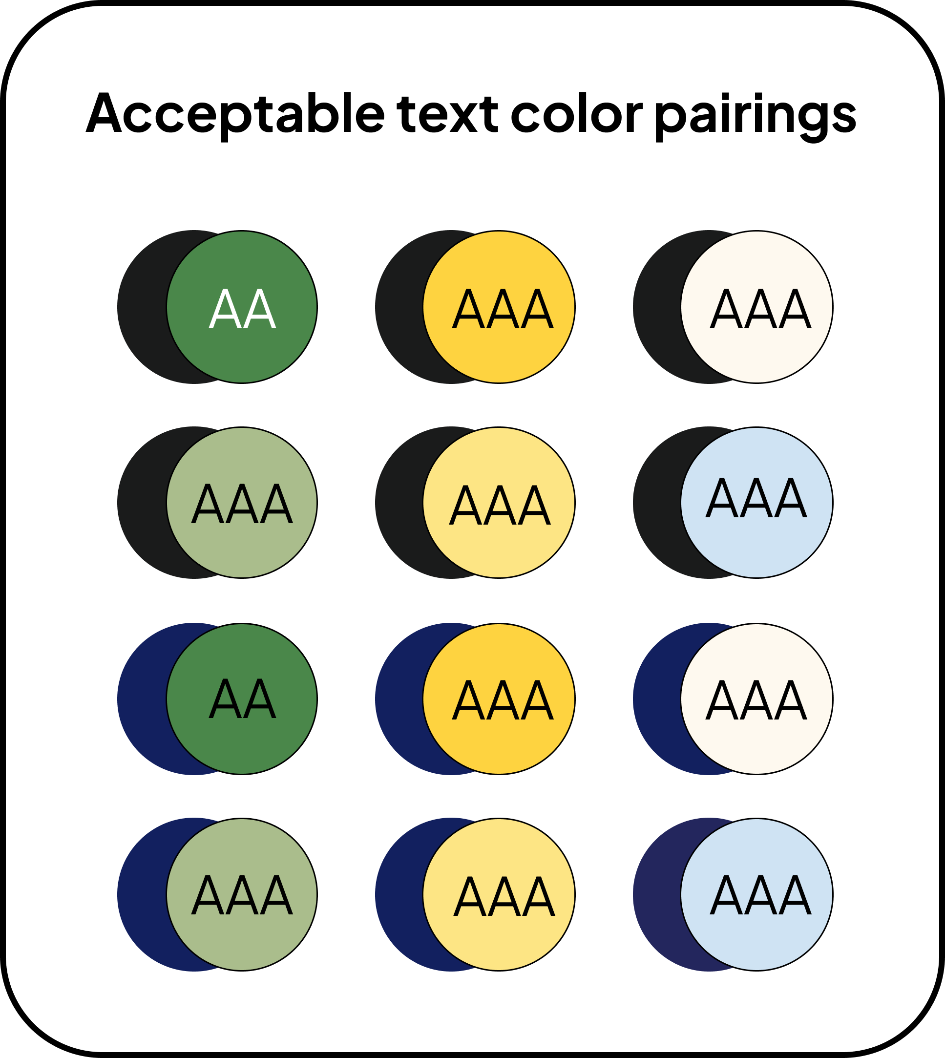
We want everyone to be able to read and use our brand materials, including people with vision differences. To do this, we follow two levels of contrast standards:
AA (Good): Colors have enough contrast so most people can read the text clearly. Great for body text and subheadings
AAA (Best): Colors have even higher contrast, making text easier to read for more people, especially in situations where there’s small text or low lighting. Great for titles and headings.
Our guide:
Regular text should always be in AA.
Important things like headlines, buttons, or calls to action should be in AAA color combinations whenever possible.
Color combinations not shown, but that are in the color palette, are fine for accents, but we won’t use them for important information.
Assets
Icons
Pattern
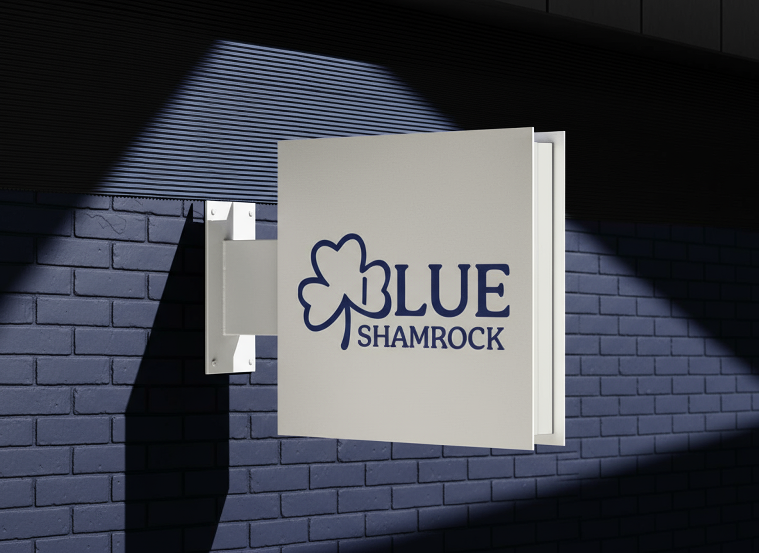
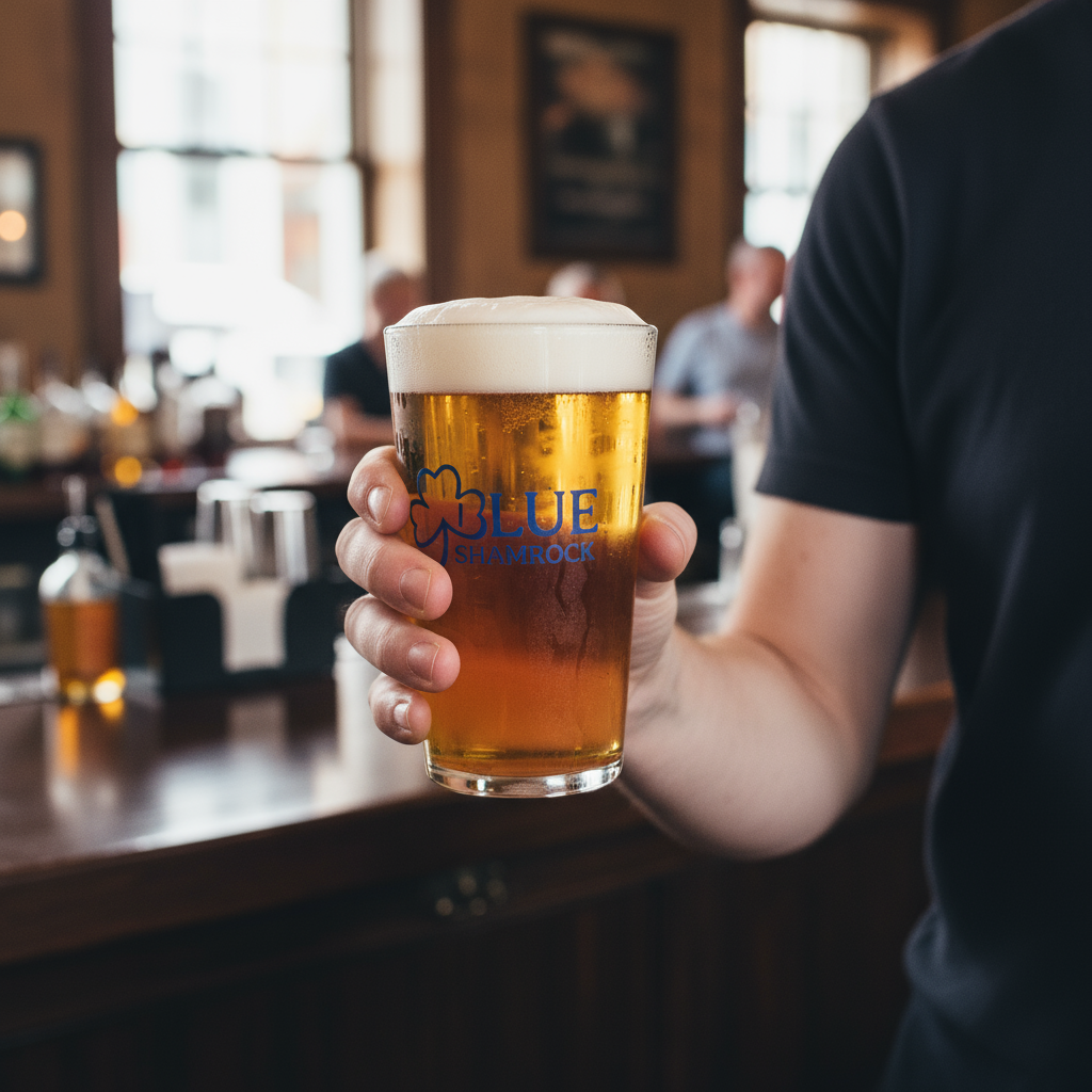
Mockups


